Bridgend Athletics is a self-funded community sports organisation with a legacy that stretches back to the 1950s. Over the decades, the club has fostered generations of athletes, many of whom have gone on to represent Wales and Great Britain at the Commonwealth and Olympic Games. Despite their remarkable history, the club faced a familiar challenge: staying relevant and appealing to a new generation of members, supporters and funders in an increasingly digital and brand-savvy world.
We were approached to help elevate the club’s identity – to give Bridgend Athletics a more professional, modern appearance while staying true to its community roots. The goal was not just to improve how they present themselves, but to reposition them in a way that would attract new members, encourage greater community engagement, and open up new avenues for funding.


Our process began with a series of in-depth workshops and questionnaires involving senior committee members and long-time supporters. These sessions were invaluable in uncovering the club’s unique spirit, strong sense of community, and the deep pride associated with being part of its legacy.
It quickly became clear that the new brand would need to respect the club’s history while signalling ambition and future growth. Their existing branding, though homespun, was authentic – a reflection of the club’s grassroots origins and volunteer-driven culture. This insight helped define the boundaries of how far we could evolve their visual identity without losing what made it special.
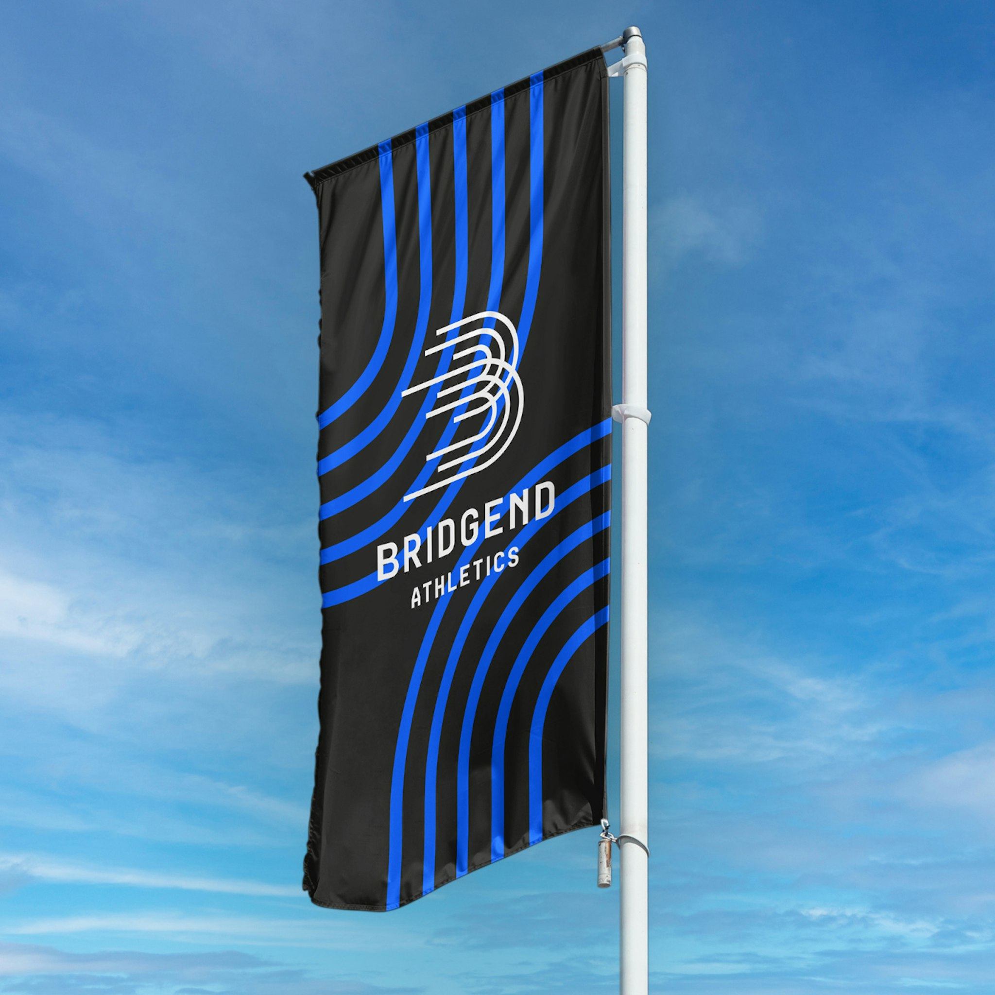
At the heart of the new brand is a bold and dynamic ‘B’ – inspired by the lines of a running track. The design draws these lines together to symbolise community, movement, and collective momentum. It’s a simple but powerful mark that speaks to the club’s mission: to help individuals of all ages participate in athletics regardless of ability.
We also advised the club to simplify their name from Bridgend Athletics Club to simply Bridgend Athletics – a small but strategic change that helps position them as a more modern, confident organisation.


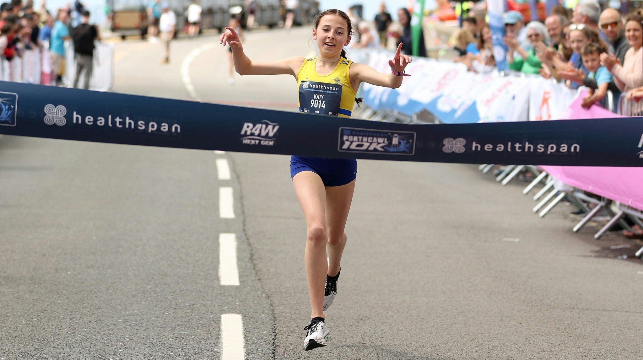
We art directed a photoshoot to authentically capture the club’s strong sense of community spirit. These images became part of a wider library of branded assets that the club can draw on for everything from social media posts to funding applications.
Alongside the visual identity, we provided guidance on website development and digital presence. Our aim was to ensure the club has all the tools they need to manage and grow the brand confidently and consistently across all platforms.


The new identity balances legacy with ambition. It gives Bridgend Athletics a contemporary look and feel that resonates with today’s audiences while honouring the decades of community and athletic excellence behind them.
We’re proud to have played a part in this chapter of their journey – and we hope the refreshed brand will inspire the next generation of athletes to go on and achieve great things.
-
Photography by Remco Merbis