In 2025, our financial services client, Carne Group, is celebrating 21 years in business. They asked us to create a logotype for the occasion.
Rather than simply designing an anniversary logo, we saw it as a strategic opportunity to inspire employees and cut through the market’s noise to capture attention. We developed a concept that serves both as a commemorative symbol and as a campaign device, supporting internal engagement, brand equity, and business development.
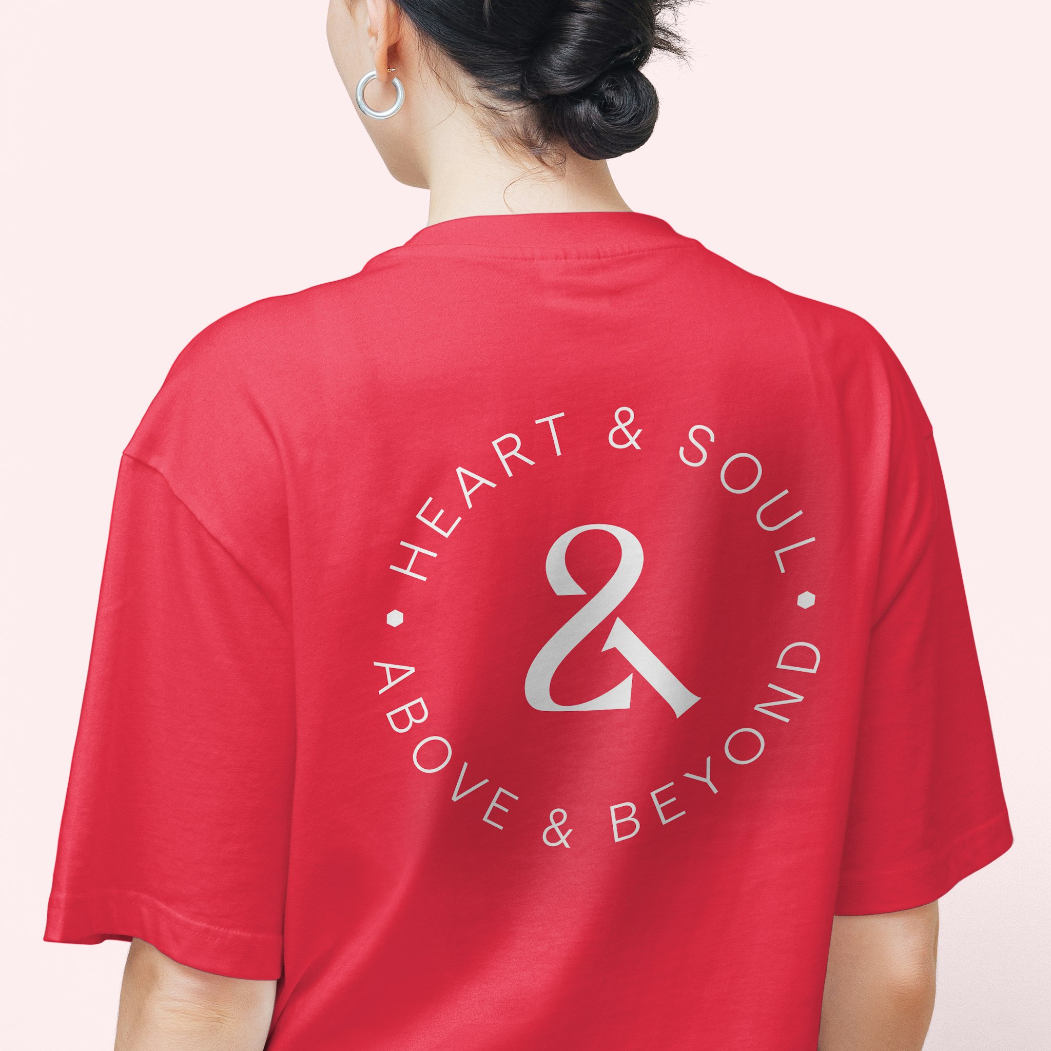
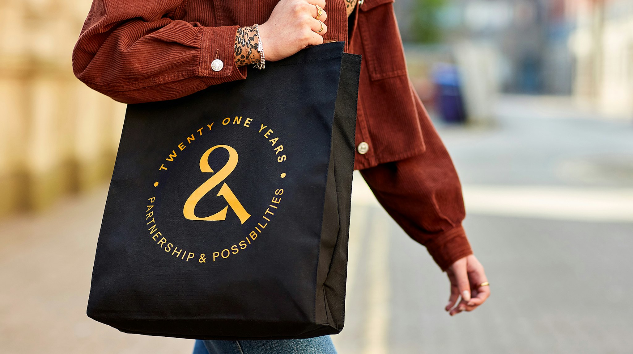
Our idea, an ampersand crafted from the numerals “2” and “1,” symbolises the power of partnerships. The ampersand became the foundation of a year-long campaign, allowing us to extend it into attention-grabbing messaging across multiple applications – even custom party bunting with 21 messages!


The approach maximised Carne’s investment by efficiently extending the concept’s reach. High-value clients received Carne 21 branded gift bags containing a bespoke bottle of wine, pen and premium diary, and Carne 21 collateral.
More than just a visual element, the ampersand embodies Carne’s core ethos: that great partnerships unlock great possibilities, reflecting the company’s values and long-standing commitment to collaboration and success.

We collaborated with lettering artist Dan Forster to craft the final ampersand. Many variants were explored, balancing the challenge of making it read as numerals while ensuring the ampersand shape remained immediate and obvious. Below is a selection of early sketched developments.
The campaign launch post alone outperformed previous benchmarks by 40%, while internally, Carne 21 content generated over 5,000 interactions on Workvivo.
We’re thrilled that, alongside our client, the project has been nominated for Brand Initiative of the Year at the Financial Promotor Awards 2025.
What our client said of the work: “First class thought and execution – as always.”
-
See more work for Carne Group.