
Brands selling mostly on functionality, with the benefits of the experience buried a few layers deep in the messaging.
Maybe it’s a lack of confidence. Maybe decision-makers are so close to the technical wizardry they built the business on that they can’t see past it.
But when product options are equally viable, functionality stops being the differentiator. The role of brand becomes pivotal, with decisions boiling down to a feeling. That’s why every aspect of a brand matters. Nothing should be overlooked or left to chance.
In the case of SolarTech – a business operating in the leisure and outdoor adventure market, their brand failed to keep pace with the growth of their product range. They raced ahead, but a lack of discipline with their brand eventually led to a fragmented, incoherent whole. The result was stalled momentum and slower growth.

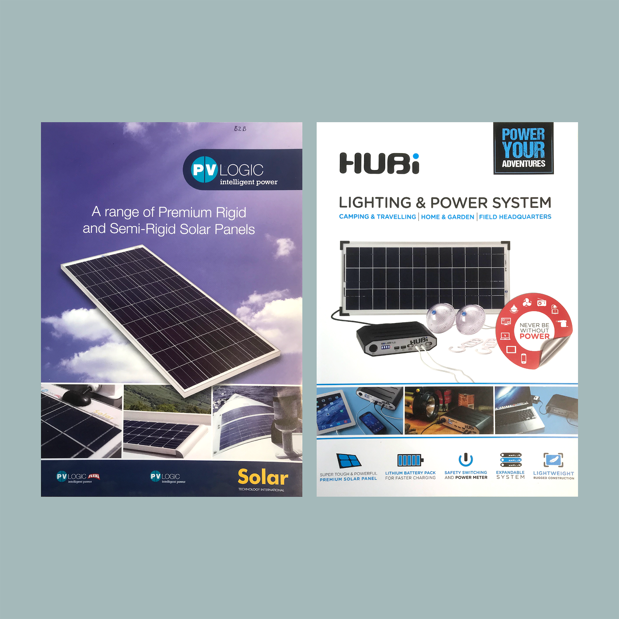
When they came to us, the brand leaned heavily on product photography – solar panels, power hubs, lighting. Paired with dense technical messaging and a cluttered, unsophisticated visual aesthetic, they struggled to standout in way that was meaningful to their adventure-loving audience.
To fully capitalise on their many industry-first products, the brand needed a fundamental shift in approach.
Our strategy focused on owning the emotional territory. Through our central idea: Without boundaries, we looked to express how their products enabled freedom and adventure in off-grid locations.

We turned a confusing packaging range into a unified product collection through a bold, illustrative style to showcase products in situ, and enhance shelf presence. Colour-coded product areas improved navigation, while simplified product information cut the clutter.


We helped the internal team understand how craft at every touchpoint influences even the smallest decisions. They listened.
Now, every detail reflects the right level of quality and embodies the spirit of the brand.
And importantly, the brand now better reflects its product price point.
The impact of our work was immediate – within the first year following brand launch, sales increased by an impressive 400%.
-
Read the full case study: Powering growth by elevating quality

