At the heart of our visual identity update is a subtle but meaningful symbol: an arrow.
At the start of the process, we spent a lot of time reflecting on what truly defines us as a branding agency. It wasn’t a straightforward process by any means – but we wanted to avoid anything that felt inauthentic, forced or disconnected from our approach and what we value. It had to be genuine – as the saying goes: practice what you preach.
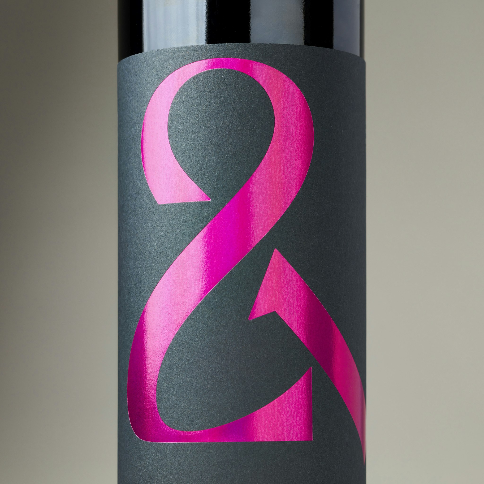
After months of exploration (between client projects, of course), we eventually returned to an earlier sketched idea: an arrow formed within the negative space of the letter “C”. At that moment, it felt right – complementing the narrative we were developing.
The arrow stands for precision – not just in execution, but in intention. It signals clarity and impact. It’s a small, considered detail that reflects something deeper about our approach to branding.
An arrow doesn’t fly by chance. It’s aimed with purpose. And it only hits the mark when it’s guided by clear, intentional thought. In the same way, when a brand is aligned with the true needs and desires of its audience, it doesn’t just reach people – it resonates. It connects. It influences.
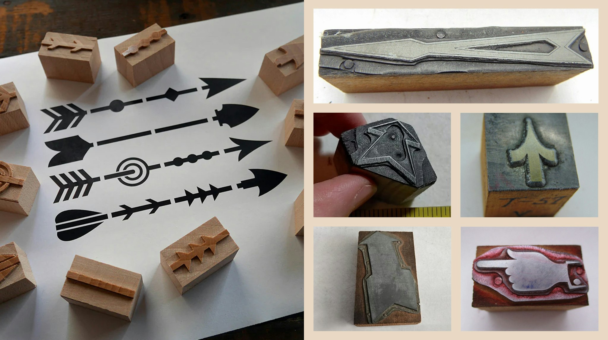
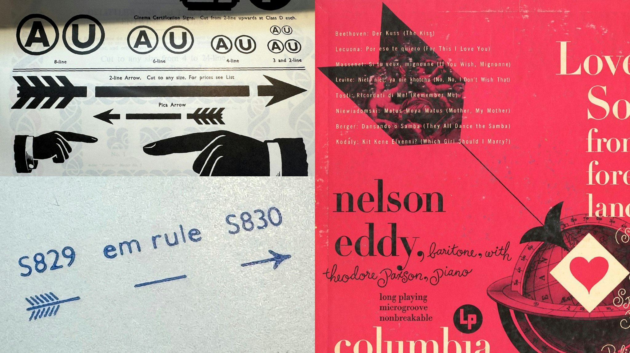
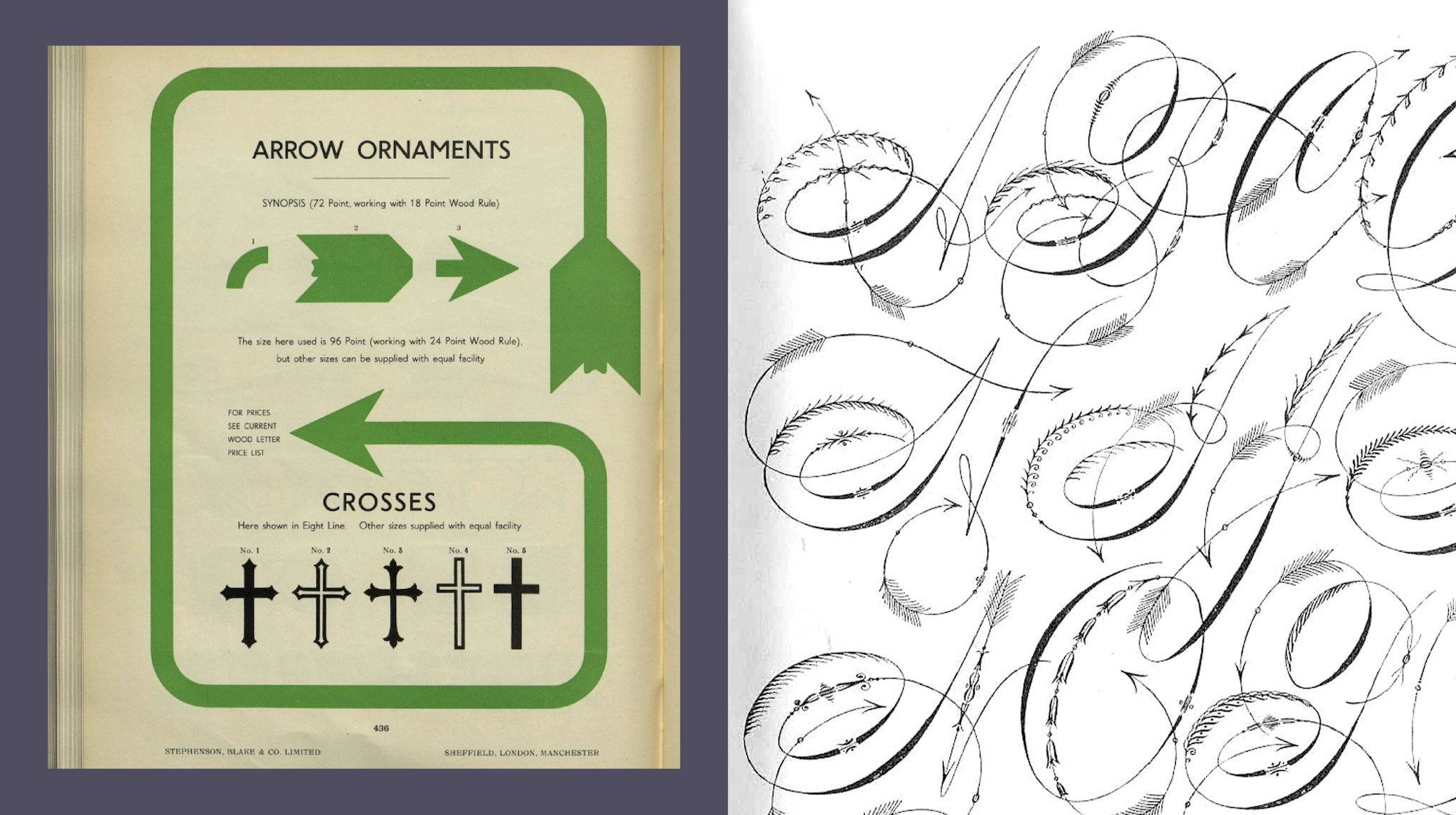
As part of our process, we explored arrows in all their forms – historical, symbolic, and philosophical. Graphically, we researched type foundries and print archives, delving into the history of decorative and ornamental arrows from early printing processes
The final logotype strikes a balance between solidity and elegance. The arrow within the “C” is part of that craft – a small detail with big meaning.
We collaborated with renowned lettering artist Dan Forster to refine the concept, working through more than 40 iterations to ensure the optical balance was just right before arriving at the final design.
The arrow also plays a role in our broader identity – from small, crafted details to bold illustrations. We’re putting all that valuable research to work.
Ultimately, it’s about precision – cutting through with intention to land with meaning – the same principle that guides our approach to brand strategy, brand design, and campaigns.
This is the thinking behind our identity, and the story behind the arrow.
-
With thanks to Letterform Archive and Typoretum for the research assistance.


