Conjura

Showing confidence to win confidence

Conjura, a data analytics business based in London, Dublin and New York, gives companies of all sizes access to the kind of powerful analytics that were once the sole preserve of mega-corporations like Google and Facebook. But potential customers were slipping through the net, unconvinced by an existing brand that felt raw and lacked confidence.

Turnover up by 315% and a team that has quadrupled in size, two years after rebrand.
New client conversions increased by 25% in just three months, following rebrand.
Grand Prix Winner and 3 Golds at Transform Europe Branding Awards.
Conjura old logo and homepage design featuring blue colour scheme and technical illustrations

Previous brand

Conjura’s previous brand struggled to build credibility – lost in a crowded sector, weighed down by jargon-heavy language and a technical tone that overlooked key decision-makers. Yet in direct conversations, their value was instantly clear. Our challenge was to bring that clarity and confidence to their brand.

  • Conjura digital advertising posters in a train station featuring bold pixel designs and campaign messages.

Making data more impactful

Core idea: from insight to foresight

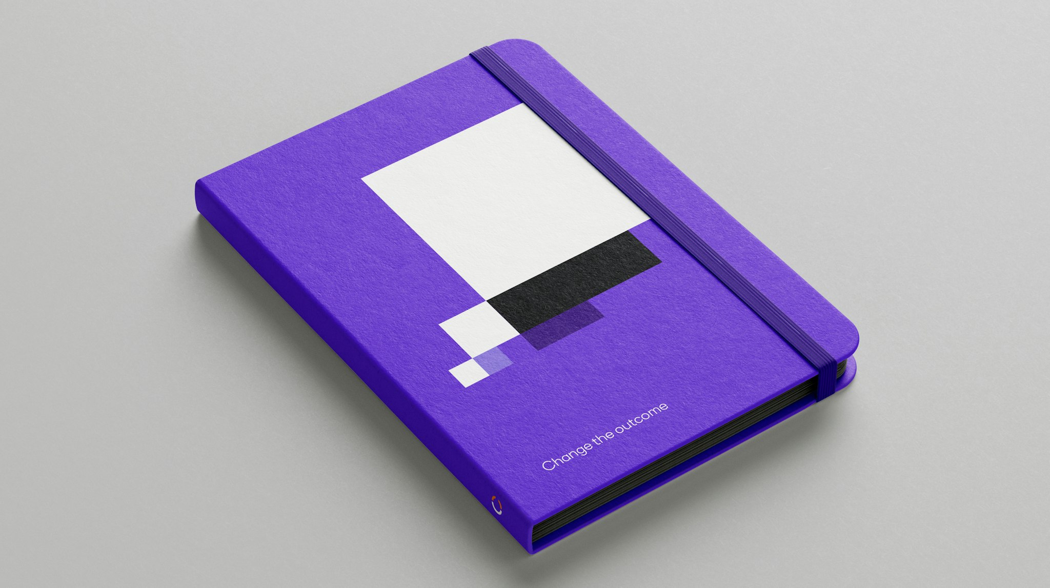
Competitors talked of ‘data insight’ and ‘data analytics’. Showing Conjura had the power to alter the course of events would differentiate them – and demonstrate the confidence their audience required. Because the information Conjura extracted gave their clients something far more valuable than insight: foresight. We brought this idea to life through compelling visual and verbal storytelling that invites people to reveal the true picture behind playfully misleading images. “Change the outcome” stories were told backwards from the outcome to the point of origin.

  • Fragmented language. The website uses the bold visual identity to create a more meaningful user experience, where fragmented and confusing images are revealed by a click or a rollover.

  • Abstract pixel composition in purple, black and white on purple background with large white text: “Struggling to make sense of your data?”

Clear, friendly, proactive

A more human tone

We took a “bring everyone along” approach to all copy: open, friendly, disarming; no jargon, no ‘insiderspeak’, even the technical material clearly explained. The result was a company that felt refreshingly simple to deal with, and tech that felt less daunting and more approachable. In a dry, technical sector, we very carefully added some playfulness where appropriate: real human beings who were great to deal with.
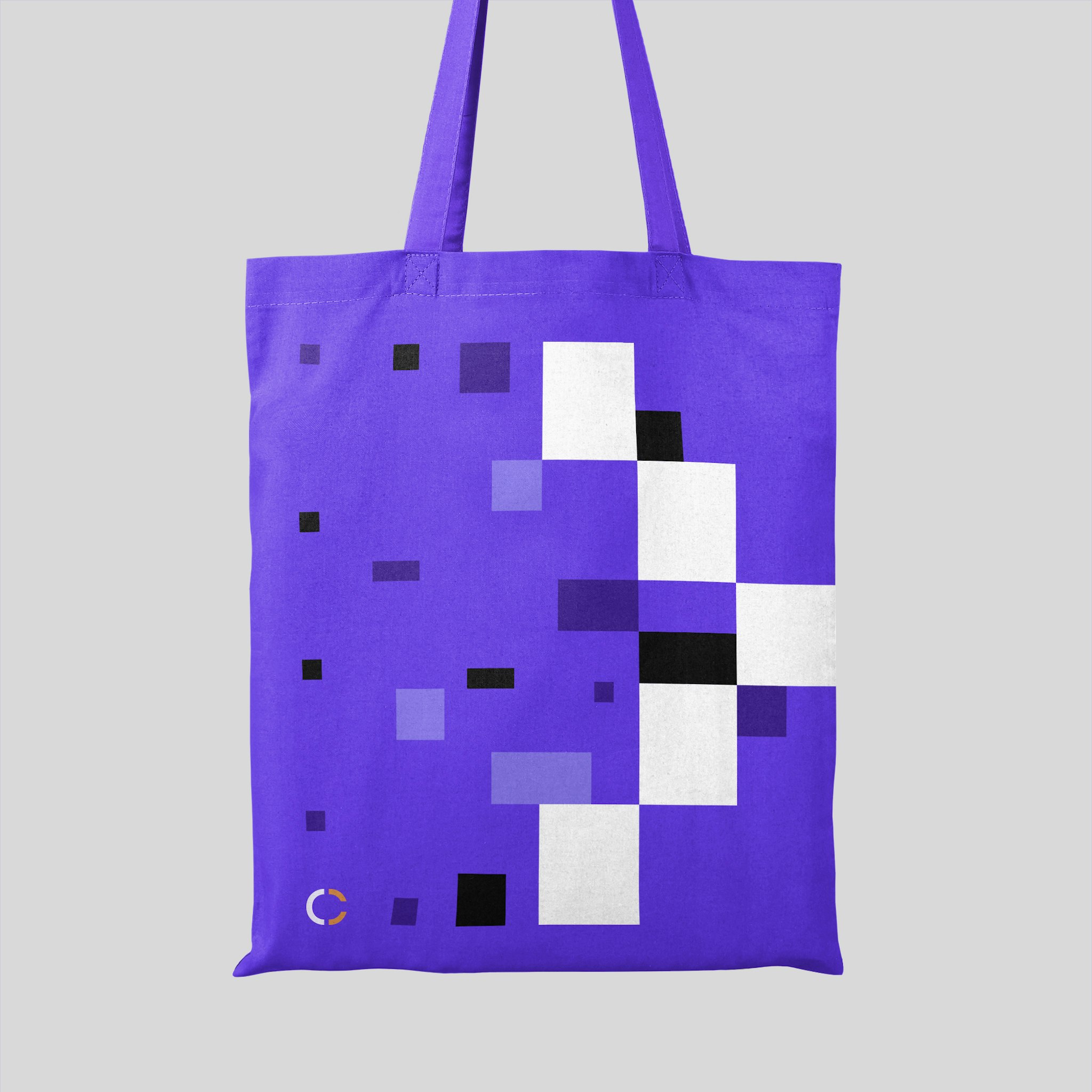
  • Laptop on light grey block in grey studio setting displaying Conjura’s ‘The Reveal’ webpage with purple pixel design and dark interface

A bold approach

Sidestepping industry norms

We recognised an opportunity to create a distinctive look for the brand, as the sector is saturated with businesses that take a similar approach. The new graphic style is bold and different – based on a fragmented grid of coloured blocks to emphasise the complexity of data. The rich purple colour palette was chosen to create a feel of quality and confidence and to differentiate amongst a sea of blue brands.

  • Purple lightbox sign featuring Conjura logo symbol mounted on textured grey wall of sleek, modern building exterior

    Logotype. The fragmented C’ reinforces a feeling of movement toward completeness – a nod to the overarching message: “Change the outcome.”

  • Reception area in dark exhibition with silhouetted people and desk before large purple screen showing pixel design in purple, black and white

    Flexible application. The fragmented graphic style offers versatility across all communications. From a series of grids, the language can be used at different scales, offering Conjura an efficient method of implementation.

  • Purple notebook on light grey surface featuring white, black and purple pixel block thought bubble and ‘Change the outcome’ text
  • Man wearing purple t-shirt featuring pixel heart design in varied purple shades and black and white, with Conjura logo symbol on right sleeve
  • Purple tote bag with abstract arrow-style pixel design and Conjura logo, hanging against light grey studio backdrop
  • Purple umbrella with yellow handle featuring raindrop-style pixel design on light grey background

Client feedback

The work was first class. The website was incredible. When we go for a new round of funding to scale again, I’ll be coming back to you, 100%. I’m waiting for my moment, but there’s no doubt in my mind who I’ll be turning to to make that step.”

Fran Quilty

Founder & CEO