Emergence
Inspiring profound transformation
The brand had to stand out in a crowded market – competing with established consultancy giants. It needed to project authority and credibility to inspire confidence that it operated at the leading edge. We named it Emergence, with a clear business aim: to help clients navigate the Fourth Industrial Revolution and emerge stronger, more resilient, and future ready. The name also carries a deeper nuance, drawn from the pioneering field of science that studies how complex interactions give rise to new behaviours, forms, and characteristics. The entire look meets the target audience’ need for inspiring but calm and reassuring leadership.


A future-ready identity
Designed to evolve
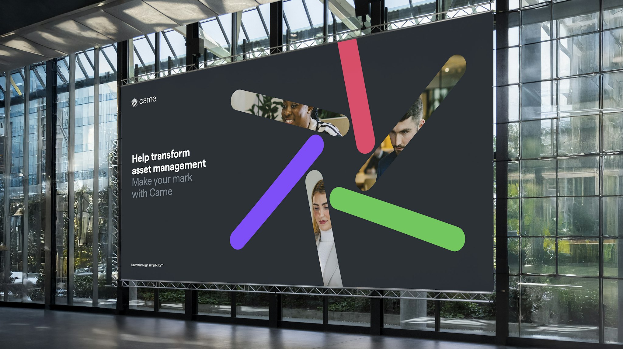
Transformation was at the heart of the visual identity – but approached with imagination, avoiding the clichés that often evoke fear around advanced technology. The identity needed to feel premium, yet infused with energy and optimism – striking the right balance between authority and freshness. Designed to be scalable and adaptable, the brand can evolve over time. Its bold, ever-shifting graphic language features shapes that contort, overlap, and transition between states. Colour is used purposefully, illuminating pathways and insights to reflect Emergence’s role in guiding meaningful transformation.


A dynamic mark
Transformation as a visual shorthand
The logomark captures the idea of transformation – moving confidently from one state to another. Three progressive arrows form a dynamic ‘E’, symbolising change and forward momentum under assured leadership, all brought to life in a bold, vibrant magenta.

Client feedback
The brand has enabled us to look professional from day one and that’s provided a lot of confidence and legitimacy to individuals within the start-up and to prospects and potential employees on the outside. The brand conveys a certain energy that we have and want to be known for. People comment that they like it all the time.”
David Poole
Founder & CEO